Search Engine Optimization (SEO)
Colors to Avoid on Websites and Their Psychological Impacts
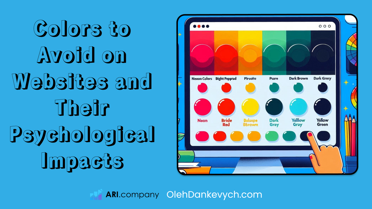
When designing a website, color selection is a critical aspect that influences user experience, perception, and behavior. While certain colors can enhance the visual appeal and effectiveness of a site, others can have negative psychological effects, causing users to feel discomfort or distraction. Here are some colors that are generally best avoided on websites, along with the psychological reasons why:
1. Neon Colors - Neon colors are extremely bright and vibrant shades that are often seen as artificial or unnatural. Examples include neon green, neon yellow, and neon pink.
Psychological Impact:
Visual Fatigue: Neon colors can cause eye strain and visual fatigue due to their high intensity and brightness.
Overstimulation: These colors can be overwhelming and distracting, leading to a sense of chaos or discomfort.
Lack of Professionalism: Neon colors are often associated with nightlife, parties, or informal settings, which can detract from a professional image on a business or corporate website.
2. Bright Red - Bright red is a very intense and attention-grabbing color.
Psychological Impact:
Aggression and Alarm: Red is often associated with danger, warning, or urgency, which can create feelings of anxiety or aggression.
Overstimulation: Similar to neon colors, bright red can be overstimulating and may cause visual discomfort if used excessively.
Dominance: While red can be used effectively for calls to action, overuse can dominate the visual hierarchy and overshadow other important content.
3. Pure Black - Pure black is the darkest color, devoid of any hue or brightness.
Psychological Impact:
Heaviness and Oppression: Black can evoke feelings of heaviness, oppression, or negativity if used excessively or in large blocks.
Readability Issues: Pure black backgrounds can make text difficult to read, especially if the text is not a high-contrast color.
Depression and Sadness: Black is often associated with mourning or sadness, which may not be the desired emotion for most websites.
4. Dark Brown - Dark brown is a deep, earthy color often associated with wood or soil.
Psychological Impact:
Dullness and Dirtiness: Dark brown can be perceived as dull or dirty, lacking the vibrancy or cleanliness desired in modern web design.
Heaviness: Similar to black, dark brown can feel heavy and oppressive if used too liberally.
Old-Fashioned: Dark brown can give a website an outdated or old-fashioned look, which may not appeal to users seeking a fresh and modern interface.
5. Dark Gray - Dark gray is a neutral color that sits between black and white but leans towards a darker shade.
Psychological Impact:
Depression and Pessimism: Dark gray can evoke feelings of gloom, depression, or pessimism.
Lack of Contrast: Using dark gray for text can cause readability issues, especially if the background color is also dark.
Indifference: Gray can be perceived as indifferent or unemotional, lacking the warmth or engagement of more vibrant colors.
6. Yellow-Green - Yellow-green is a color that blends yellow and green, often resulting in a shade that can be described as lime or chartreuse.
Psychological Impact:
Sickness and Toxicity: This color can be associated with sickness, toxicity, or unpleasant tastes and smells.
Irritation: Yellow-green can be irritating to the eyes and may cause visual discomfort.
Unattractiveness: It is often considered an unattractive or unpleasant color, which can detract from the aesthetic appeal of a website.
Choosing the right colors for a website is essential for creating a positive user experience and effectively communicating your brand's message. While colors like neon shades, bright red, pure black, dark brown, dark gray, and yellow-green can have specific applications in certain contexts, they are generally best avoided due to their negative psychological impacts. Instead, opt for colors that enhance readability, evoke positive emotions, and align with the overall aesthetic and purpose of your website.
Thank you for reading!